Showing posts with label Exploring.... Show all posts

Exploring the US Federal Budget - an Interactive Visualization (d3.js)

I am in the middle of working on a visualization for exploring the US Federal Budget, built with d3.js, bootstrap, and jQuery DataTables. The current version can be found at:

Please let me know if it looks weird on your browser or its use is non-intuitive. A summary is below of browsers I have checked so far.

Exploring the US Federal Budget
http://learnforeverlearn.com/usbudget/
Data: 1962 to 2019

The spending and receipts data files are from the OMB's Public Budget Database, available at http://www.whitehouse.gov/omb/budget/supplemental. Specifically, the "Outlays" csv file and the "Receipts" csv file. These contain both historical and projected data, going back to 1962 and up to 2019. I have spot-checked the rolled-up values against the corresponding values in the Historical Tables file from the gpo (which checked out), but this is still a work-in-progress.

Responsive Design - a Work-in-Progress

Perhaps obvious, but I have decided that every single possible screen size requires a potentially completely different interface design, with unique decision encumbrances for all of them. Each may present a nice little puzzle, but there are a wearying number of them. And it is difficult to predict ahead of time what the necessary adjust will be be: you have to see it.

So far, I have attempted to deal with a handful of cases, a few of which are listed below. I have tested only on Chrome on a Mac, an iPad, and an iPhone. It will be interesting to see how well the other browsers handle it.

Large Screen Desktop, iPad Landscape

In this case, all of the features are available, and you can explore the detail tables.

Large screens and iPad Landscape: you can drill down into detailed tables
Small, But Room at the Bottom

In this case, there are no detailed breakdowns available, but there's sufficient space for the horizontal scroll region at the bottom, where you can select different years.

Small Screen, but Room for the Horizontal Bar
Small, and No Room at the Bottom

In this case, there are no detailed breakdowns available, nor does the horizontal scroll area have enough room (per my current parameters), but you can change years and see the totals and how the spending breaks down in terms of mandatory, interest, and discretionary.

I have yet to deal with iPhone landscape.

Friends Don't Make Friends Read Vertical Text

In some cases, the red bar for the deficit is too small for a label. In these cases, the label dynamically slides out when you select one of these years, and tries to be as non-vertical as possible (there's a little leeway still to optimize, I think). An example is shown below. It's debatable if angled text is any easier to read than vertical text, but maybe it's the thought that counts.

Moving the Deficit label out when necessary,
but not going vertical, on a small screen
Browsers tested so far
  • Chrome on iMac - OK
  • Chrome on iPad - OK
  • Chrome on iPhone Portrait - OK (landscape needs some redesign)
  • (via Browserstack) Chrome on Windows 7 - OK
  • (via Browserstack) Chrome on Windows 8.1 - OK
  • (via Browserstack) Safari on Windows 7 - OK
  • (via Browserstack) Safari on Windows 8.1 - OK
  • (via Browserstack) IE9/10/11 on Windows 7/8.1 - should work now, but not yet confirmed - Something weird was happening with text that's supposed to be inside labels - turned out to be (I think) lack of support for "alignment-baseline" for svg text elements (see this msdn page)
  • Firefox 32 on Mountain Lion - like IE, Firefox does not support "alignment-baseline" - stopped using it and worked around it and things look ok again
  • (via Browserstack) Firefox 31 on Windows 7 - should be OK now - Same issue as IE
  • (via Browserstack) Firefox 31 on Windows 8.1 - should be OK now - Same issue as IE
  • (via Browserstack) Opera 23 on Mountain Lion - OK
  • (via Browserstack) Opera 23 on Windows 7 - OK
  • (via Browserstack) Opera 23 on Windows 8.1 - OK
  • (via Browserstack) Android on Nexus 7 - "Page has become unresponsive" - suggests optimization is getting past the premature stage
Next Steps

I have a healthy number of TODO's yet to get to - figuring out why IE and Firefox are misbehaving on Windows 7/8.1 is the current top priority item (the issue was that neither supports the alignment-baseline tag for the svg text element). There is also some usability considerations that I need to address based on some initial feedback.

Exploring the US Judicial System - A Work-in-Progress D3.js Visualization

As part of a fairly ambitious project to visualize the dynamic activity of the US judicial system, I have put together a visualization of the basic structure of the court system. I am still cleaning things up, but consider it at a point where additional feedback would be helpful (and please let me know what needs to be corrected/clarified if you notice something!).

Mousing over just about anything on the visualization will bring up a popup with more information.

The visualization is currently available at https://googledrive.com/host/0B2GQktu-wcTiWm82NGt5MTZreHM/.

Visualization of Yaroslavskiy's Dual Pivot Partitioning for Quicksort

I have recently been playing with various aspects of the quicksort algorithm. One aspect that is fascinating to me is that just a few years ago (in 2009), there were significant improvements made to it by Vladimir Yaroslavskiy. He showed that a dual-pivot approach could be better performing than existing methods, despite the general consensus which had been (justifiably) likely swayed by Robert's Sedgewick's analyses several decades ago. Yaroslavskiy's algorithm was tweaked by Jon Bentley and Joshua Bloch and included as the core sorting algorithm in Java 7. This is no minor accomplishment, imo.

I am very curious why Yaroslavskiy decided to tackle the problem this way, given the historical opinion of dual pivot methods.

Anyway, I built on some of my recent little projects to create a visualization that is intended to provide some insight into Yaroslavskiy's approach.

The visualization is available here (best on Chrome desktop at the moment, I haven't used it on any physical mobile tablets yet, I just took a peek or two in the ChromeDev emulator for iPad and Nexus 7):

(site url is https://googledrive.com/host/0B2GQktu-wcTiNEtsejVjRWlmaWs/)

Exploration of the Lognormal Distribution - a D3/MathJax/jStat Interactive Visualization

This is a short note on a interactive visualization I have been playing with. It is embedded below from this site on googledrive. Depending on your browser and device, there may be rendering quirks with MathJax and/or the embedding iframe - please let me know if you see any oddities. It looks fine for me in the latest version of Chrome on a desktop (and I've updated some things to improve responsive design).

Exploring Family Trees - a D3 Visualization

Note: this has been updated to allow loading your own GEDCOM files or viewing sample trees. The updated site is at https://learnforeverlearn.com/ancestors/

My wife loves to play around on Ancestry.com.  Every now and then, I'll help her out with one of the trees.  It's interesting, and fun to see those little dynamic leaves pop up when there is a "hint", and you can then see about going further back in time.   Genealogy is a huge business.  Every one of us has a family tree, and we like seeing where we come from.  That's how we got here.

On one of the recent Ancestry shows "Who Do You Think You Are", the hosts got Cindy Crawford all excited because they could trace her lineage to Charlemagne, who lived in the 700's.  Of course, based on a number of factors, it would have been far more interesting if she had NOT been related to Charlemagne.  What they showed her was one path back to Charlemagne.  There are many more ancestors at each level, and we know that, but we are so bad at comprehending exponential growth that this kind of connection can sound impressive.  We might read how everyone should be related to Charlemagne, and how the number of our direct ancestors explodes very quickly as you start going back in time, but it is still hard to grasp that.

This has led me to want to come up with a visualization or visualizations that might be able to make this growth more plain (and to play with other features of d3.js).

Using the Google Translation Gadget on a Dynamic Website

Update (Oct 22, 2013): a short demo of the latest version of the visualization is available on youtube

I recently learned of the google translation gadget for web sites.  Basically, you stick some javascript on your web site and it will translate the site to any of about 70 languages.  I have been playing with getting this to work with minimal flicker of changing of translated text for the d3 World Births/Deaths visualization, as it seemed appropriate given the nature of the project.  A first cut is available here

https://googledrive.com/host/0B2GQktu-wcTicEI5VUZaYnM1emM/

The way the gadget works is (apparently) to translate anything it sees: static text as well as new text added to the DOM.  It uses a small flash component (from google) to help with this.

The Visualization translated to French
by the Google Translation Gadget

A Tool for Exploring Co-occurrence matrices and Recommenders

As part of becoming more familiar with recommender systems, I put together a simple (work-in-progress) tool to explore how recommendations are calculated using the basic methods discussed in Mahout in Action (and elsewhere).  The site is on googledrive here.

My main goal with this tool was to provide a way to explore the connections between the various entities used in the (mostly matrix) calculations - this is attempted via mouseover popups and dynamic highlighting of related quantities.

Figure 1.  A Tool for Exploring Simple Recommender Systems
https://googledrive.com/host/0B2GQktu-wcTiWHRwZFJacjlqODA/

There are three main sections in the visualization.
  • A section with the raw data of interactions between users and items, and the resulting user-item matrix of interactions
    • The raw data consists of lines of the form user,item; this reflects that there is some kind of interaction between a user and an item: a view of a web page, clicking a link, a purchase, viewing some portion of a video.  This kind of data would be something parsed from web log files, etc.
    • The tool is based on simple boolean "was there an interaction?", rather than including ratings.  It has been my impression that the importance of ratings is frequently overrated, given the noise that can accompany them.
    • The user-item matrix A is simply another view of the raw data, but serves as the starting place for further analysis.  Moving your mouse over an entry of the user-item matrix will highlight the corresponding raw data, and vice versa. I think it's nice to see this side-by-side with the raw data, as it helps to reinforce the connection that can be harder to grasp when viewing things in a static context (see Figure 1).
  • A section showing the calculation of the co-occurrence matrix itself
    • This is calculated by multiplying AT, the transpose of the user-item matrix, by A
    • All of the intermediate matrices are shown here, and mousing over an entry of the co-occurrence matrix will highlight not only the relevant rows and columns of Aand A, but also goes back to the raw data itself (see Figure 2).  When you do this, you also see that the entries of the co-occurrence matrix are simply the similarities between the various columns of the user-item matrix.  While I may have basically known this, I found that seeing it materialize in front of me was a fairly powerful and effective mechanism for personal learning.  I also then saw that all of the other similarity measures (log-likelihood, Tanimoto, Cosine, Pearson, etc.) can be viewed as simply alternative ways to define the matrix product, or equivalently, replacing the dot product of columns with other functions of the columns vectors of the user-item matrix.  This seemed to corral the swimming concepts a bit in my head in a surprisingly satisfying way.
    • I tried to use colors to reflect how the difference pieces come together: yellow for the relevant row of AT, and blue for the relevant column of A, resulting in green in the co-occurrence matrix itself.  I am not sure how effective this is, but I think that it is important that the colors are different.
  • A section showing the co-occurrence matrix, a (changeable) user-interaction vector, and the final recommendation weights that would be used for recommending new items
    • You can click the checkboxes to indicate an interaction with an item, and the recommendation vector is automatically updated
    • Putting your mouse over an entry of the recommendation vector itself will highlight the relevant columns of the co-occurrence matrix that actually contributed to the recommendation weight - these columns correspond to the rows of the user interaction vector that are checked (see Figure 3).
    • The popups in the recommendation vector are intended to cover a variety of cases
      • when the entry corresponds to an item (or items) that would be recommended first
      • when the item would not be recommended because the user has already interacted with it (via the specified user interaction vector itself)
      • when the item is eligible for recommendation, but its calculated value in the recommendation vector is not the largest

Figure 2.  Showing the connections between an entry of the co-occurrence matrix,
the user-item matrix and its transpose, and the raw data itself

https://googledrive.com/host/0B2GQktu-wcTiWHRwZFJacjlqODA/

Figure 3.  Showing the connections between a calculated recommendation weight, the current user-interaction vector, and the relevant entries of the co-occurrence matrix
https://googledrive.com/host/0B2GQktu-wcTiWHRwZFJacjlqODA/

This has been a fun thing to put together, and for me seemed to definitely help highlight and reinforce various concepts related to recommender systems.  Please feel free to let me know of errors in my interpretation, clarification needed, etc.  Learning is a subjective thing, and there may be additional little nuances that could be added that could help better convey the details.

Exploring Bayesian Bandits - an Online Tool


Note: The Tool is Online Here

  I have been reading a bit recently about so-called Bayesian Bandits, as referred to by Ted Dunning.  This problem involves the challenge of picking a strategy of playing N slot-machines some number of times, where the probability of winning for each slot machine is unknown.  This problem has a number of interesting applications in display advertising, news article recommendation, and click-through-rate prediction (Agrawal and Goyal, 2012). As noted by Dunning,  any solution must effectively handle the explore/exploit trade-off challenge.  The implementation in this case - using Thompson sampling - is straightforward, and I can see how it could smoothly allow for quick updating as more data/information becomes available.

Exploring Sensitivity of Log-Likelihood Scores for Bigrams

I have been playing with a simple online tool that will take a text document and calculate the log-likehood scores for all of the bigrams in the document, and generate the sorted list.

One of the things I wanted to be able to easily do is explore the sensitivity of the calculated log-likelihood scores on the entries of the contingency matrix for each bigram.  This feature has been added and the tool updated.

For exploring the impact of changes to a contingency matrix, you can either manually enter specific values in one of the contingency tables, or drag your mouse left or right on a specific entry in order to decrease/increase the values.


Explore the Impact of Changes in the
Contingency Matrix Values on the LLR Scores
(available for arbitrary text documents at 

https://googledrive.com/host/0B2GQktu-wcTidC01Ym1lR2h1TTA/)

Using a slightly modified version of the matrix from Dunning's ( http://tdunning.blogspot.com/2008/03/surprise-and-coincidence.html), we write the contingency matrix as


Starts with Word 1Not Word 1
Ends with Word 2k_11: Count of the bigram Word 1 Word 2k_12: Count of bigrams that end with Word 2, but do not start with Word 1
Does Not End with Word 2k_21: Count of bigrams starting with Word 1 but not ending with Word 2k_22: Count of bigrams that do not start with Word 1 and do not end with Word 2


and the log-likelihood score is calculated from the terms k_11, k_12, k_21, k_22.  

The "exploring" involves watching the impact of changes in the values k_ij.  At the moment, you can only increase/decrease a particular entry.  However, in reality there are additional changes that are of interest; namely, keeping the total number of bigrams constant when changing a particular value k_ij, so that there has to be a corresponding change in the other value(s) when k_ij is changed.  In fact, because of the lack of this restriction, it may be the case that you end up with a contingency matrix that could not occur for bigrams in a document.  

You can also get other on-first-glance weirdness: very high LLR scores without having the bigram itself appear at all - at least, based on how the entries of the matrix are interpreted.  As an extreme, for example, the LLR for the contingency matrix (k11,k12,k21,k22)=(0,100,100,0) has value 277.3, even though since k11=0 it would mean that the bigram itself did not occur at all.  However, in this case the RootLLR is negative (at -16.7), indicating that the bigram appeared fewer times than expected (see http://s.apache.org/CGL).  The RootLLR is defined as

RootLLR = signum[k11/(k11+k12) - k21/(k21+k22)] * sqrt(LLR)
        = signum[0 - 1] * sqrt(277.3)
        = - 16.7
                     There is much more to explore here.  

A Simple Online tool for Exploring Bigrams in Text Documents

The methods described in Ted Dunning's Surprise and Coincidence blog post regarding the log-likelihood ratio score can be used for a variety of interesting applications.  This score is simple to calculate, and yet apparently can capture "anomalous" rare events for filtering purposes.

To help me better understand this, I have started a small online project that lets you calculate these scores for bigrams of a given text document.  You can use a text file from your machine, one of the preselected ones from Project Gutenberg, or the MED dataset from the Classic3 dataset. The contingency table upon which the score is based is also shown for each bigram.  Note that currently a list of stopwords (based on Ken Church's ngrams tutorial)  is used so that bigrams that include these words are not included in the analysis (e.g., "of", "they", etc.).  I am not sure whether this list should included in an upfront fashion or not, and am still researching a better way to address this kind of thing.

This is still very much a work-in-progress.

Performance-wise, it seems to run fine for files up to about 1MB or so (javascript web workers are used for the raw processing on a file).

You can selectively add/remove words from the "top" bigrams by clicking on the words.  "Noise" seems to be an issue that has not been addressed here in any serious way yet - there are lots of "nuisance" words that show up (especially since the Project Gutenberg files were not modified in any way), and this is in spite of the use of a common set of stopwords  - in fact, that's why I added the easy ability to remove additional words dynamically from the list by just clicking on them (either as a start word or end word in a bigram).

Top Bigrams from Moby Dick  (full list of 75 not included here)
(from https://googledrive.com/host/0B2GQktu-wcTidC01Ym1lR2h1TTA/)

The (relatively simple) calculations of the log-likelihood scores themselves are done with a straightforward translation of the LogLikelihood.java class from the Apache Mahout project.  Also, the handful of log-likelihood tests from that project were used to find an issue with the calculations in the javascript version (that was fixed June 23).  Also included are the "root log-likelihood ratios" (see this mailing list post by Ted Dunning for some background on this).

The contingency tables are included to assist the ongoing debugging, and the plan is to make visible more of the intermediate calculations and statistics for each "run".

A Simple Tool to Interactively Explore SVG Markers

SVG in the browser offers some interesting and powerful capabilities with respect to lowly line markers for arbitrary paths (http://www.w3.org/TR/SVG/painting.html#MarkerElement). However, from my point of view, the documentation is a little confusing, and it is difficult to experiment in an interactive way in order to better understand what the various parameters are. And even for a marker, there are a surprising number of parameters, some of which may interact in unexpected ways.  And then there's the  issue of how the different browsers have actually implemented the specification.

With this in mind, I have started creating a tool - based on d3.js - that lets you twiddle the various parameters and see the impact on the rendered marker.  It is on googledrive here:

How do all those parameters affect the rendering of the end marker
(an arrowhead in this case)?

You can enter specific values to see the impact (and d3 transitions are used to animate these changes), or you can simply click in one of the input boxes and drag the mouse up and down - this will increase/decrease the parameter and allow you to see how those changes affect the rendered marker.

Note that the red box is added as part of the marker to try to assist with how the viewbox parameters affect the marker.  I have checked several times, and it seems to be putting the right values in, but some odd things seem to happen to the marker relative to the box for some values.

I had been meaning to put something together like this after fighting with end markers with this visualization to explore how PageRank is calculated, and last night I came across a nice jsFiddle (which itself is based on this example by Michael Bostock) - this inspired me to go ahead and start implementing this.  In addition, implementing the ability to simply move the mouse in the inputs in order to see dynamic changes - while not really anything new - was inspired by the amazing work by Bret Victor, whose mind-blowing visualization tools and approaches are opening up new avenues of creative exploration.


Hitting the Powerball - An Interactive Simulation

Note: This has been updated to reflect the changes in the ranges for the numbers.

The powerball lottery is big right now, and it got me to thinking about how unlikely it is to win (that's nothing new).  The odds of winning are about one in 175 million.  Assuming about 100 drawings a year, and if you played every time, this means that you might expect to win once about every 1.75 million years.  That's a long time between winnings.

Anyway, I put together a simple statistical simulation (still a work in progress) that lets you run experiments with how long it might take your numbers to hit the jackpot.  It's on googledrive here.

Feel Lucky?
Try it yourself on google drive here 

The simulation uses a web worker to perform the simulation - it just draws the numbers over and over until the number hits or you give up.  It uses "Robert Floyd's algorithm" to pick the 5 distinct numbers in the range 1-59 (see here for a starting place for this tiny but clever algorithm) .  One could also more quickly determine whether you win for a given drawing by simply sampling from a Bernoulli distribution independent of actually modeling each of the balls being picked, but it seemed more interesting to go ahead and implement the individual components of the actual process that occurs in reality.

While of course the javascript is exactly the same on all browsers, I am noticing differences in how often it seems to "hit" across the browsers.  Chrome seems to take longer for some reason.  This might be an artifact of something off in this (simple!) implementation, or due to low-level differences in the browsers themselves, but it seems to be a real difference I need to look into more.  Safari seems to behave more reasonably, but that is a qualitative assessment at the moment. Update: I am now using version 2.1 of the random number generator by David Bau  (seedrandom.js).

The dates get big.  This hit some weirdness in the date formatting in Chrome, which doesn't seem to like it if the year gets above about 276,000 A.D.  I guess that's a reasonable edge case for Chrome to consider low priority.  Anyway, I had to make use of the fact that the Gregorian calendar repeats every 400 years to get around this.

It would be nice to add some additional visualization components to this - a dynamic graph showing you move out in time, occasionally almost hitting it big, and all the while displaying the amount spent to date.  This would help drive the simple point home, but I think seeing those crazy looking years in this initial version does, too.

Exploring Convergence of the PageRank Algorithm

As part of learning more about the PageRank algorithm, I created a web app that lets you add/remove nodes and links, and see how this might impact the calculated PageRank values for small web systems. I have now also added the ability to watch how the power method converges (or not) to the PageRank vector for a web system.  You can step forward or backward in the iteration process, as "stuff" moves amongst the pages each step.  This can be particularly interesting in cases where the method does not converge, as you can (usually) see the stuff cycling through the system.

You can play with it here: https://googledrive.com/host/0B2GQktu-wcTiaWw5OFVqT1k3bDA/

You click the "Explore Convergence" button to explore the convergence, and click the "Hide Convergence" button to return back to "normal mode".

Click the "Explore Convergence" button over there on the right to watch how the power method converges (or doesn't converge, if that be the case).

Once the "Explore Convergence" button is clicked, a few extra things related to the power method are shown on the screen near the top.  Clicking the "Hide Convergence" button will hide this extra stuff, and show the final result of the iteration method once again.

By using the left/right arrows anywhere on the page (or by using the slider), you can step forward or backward through the power iteration method.

One thing that might stand out to you is how stuff will get sent to apparently "disconnected" pages as the method progresses.  This is because - unless the damping factor is one - the PageRank algorithm forces every page to be connected to every other page in the web, although the "pipes" between the pages are very small.

Exploring Google PageRank - the Impact of "Distant" Links

This the second little note about playing with the Google PageRank algorithm using this little work-in-progress web app.  The results below should be reproducible with it (or let me know if it's not!).

Note that it has been stated that PageRank is now one of over a hundred factors used to rank pages, so it is unclear how much this matters for Google's rankings today.

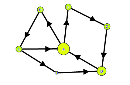
Here's the before - the sizes of the circles correspond to the calculated PageRank (damping factor 1, but that doesn't seem to affect the results in this case):

A Little Web - Sizes Correspond to Calculated PageRank
The ranking is A=H=E>D>B>C=F, with values 0.25,0.25,0.25,0.13,0.12,0,0, respectively.

Now, see what happens to when we connect A to F:

A Little Web - One Page Adds a Single Link and It Has an Impact on PageRank

All we did was connect A to F, and yet the impact is surprising.  The ranking is now A>B>C=E=F=F>D, with values 0.25,0.19,0.13,0.13,0.13,0.13,0.6, respectively.

What struck me when playing with this was the impact on page D.  It is not directly connected to A at all, and yet its PageRank gets cut in half (from 0.13 to 0.06) and moves from 4th to last, all because of something that happened somewhere else.  The impact of a "distant" small but abrupt change that, even in the case of a tiny network, is difficult to predict.  And what about a network of 42 billion pages?

This Miyoko Shida Rigolo performance seems relevant yet again.


Exploring Google's PageRank

I recently started looking at Google's PageRank, and as part of trying to understand it a little better I made a simple web app to see how PageRank depends on the damping factor, links, etc.  The actual implementation includes the breaking out of the "dangling nodes matrix" as discussed in  Dave Austin's nice article on PageRank.

The web app is on googledrive here.

With this you can

  • create custom web system systems, and see how the PageRank of pages is affected by adding/removing links or other pages
  • see exactly what the underlying matrices are used in the calculation of PageRank, and how they are related to the web system
  • step through the iterations of the power method in the estimation of PageRank

The work-in-progress app is built using:
simple tool to play with Google's PageRank - Add/Delete Pages or Links,  or Explore Convergence of the Power Method

One of the main goals of this project is to show the actual intermediate matrices used in the calculations  so as to try to maintain the connection(s) with the starting web structure as long as possible.  These matrices are updated dynamically as you modify the graph or the damping factor (in addition to the PageRank calculations themselves, of course). 

Per usual, power iteration is used to estimate the PageRank vector. For the most part, it seems to converge in a handful of iterations, and sufficiently fast enough to allow updating for any change of the slider that controls the damping factor.  I have seen a few cases where, with the damping factor set at 1.0, it did not converge within 20,000 iterations.  As pointed out in Austin's note (with some examples), the power method can fail to to converge in this case if the resulting Google matrix is not "regular" (some power of the matrix has all positive entries).

I knew things were big in real life, but one thing that caught my attention was the magnitude of the size of the actual Google matrix for the web.  For example, if its full contents were to be written on the screen, where each column gets about a quarter of an inch, then since there are about 42 billion web pages considered (assuming that the worldwidewebsize.com value for Google is approximately correct), your screen would need to be about 166,000 miles wide and tall... it would extend nearly 70% of the way to the moon.  Even if each column was reduced to the size of a pixel on an iPad retina display (264 ppi), the screen would still need to be about 2500 miles wide and tall.  Of course, the excessive sparsity of the underlying matrices is exploited when performing calculations.

Time & Money - a Box2DWeb Visualization

We read about money rates all the time, and see numbers thrown around for how much something is costing per hour or per year. What would it look like to "see" that money as it was being spent?  This work-in-process project is one way to visualize it.  You can see the visualization here on googledrive.

Using the Box2DWeb physics javascript library, along with the public domain images of coins and (specimen) bills from the public web sites of the United States Mint and the Federal Engraving Bureau, this visualization provides some perspective on the relationship between time and money.

Currently, it is best viewed on a desktop with Safari, Google Chrome, or Mozilla Firefox.  On Internet Explorer 9,  it may act a bit flaky and this has not been completely tracked down yet.

Time & Money (click to open website in new window)

The visualization shows money being "dropped" corresponding to a specified or calculated rate. It can be used for visualizing real-time dollars per hour for a person or group, or annual expenditures by institutions.

I believe that just seeing those coin and/or bills piling up or rushing by for a few moments can stick in one's head: it adds an extra level of "realness" to the connection between time and money.

Clicking on a coin or bill will suspend it in the flow, and bring up a popup that provides summary information on the particular currency (e.g., the designer).

There are a few preconfigured scenarios as well, using estimated rates: the combined cost of Congress and the Executive branch, the US budget, the US budget deficit, and the total income of the entire US working population.

Note that while I was able to estimate costs for the Senate and House of Representatives,  the costs associated with the Executive Branch are extremely difficult to simply find, let alone estimate.  For the purpose of this visualization, the 2008(!) vaue of 1.5 billion dollars from Bradley Patterson's To Serve the President is used.  I could not find any criticism or corrections of these estimates, but will update the default values should better public lower bounds become available.  However, exact and precise values are not considered critical here: the point is that whatever the amount, it's big.

I think it would be interesting to see the impact of some kind of tool like this if they showed it on a large screen on the House floor, the Senate floor, at White House press conferences, or at the State of the Union speeches.  It just seems like it would heighten focus and attention to productivity.

Special Thanks


The coin and "specimen" bill images are from the public web sites of United States Mint and Federal Engraving Bureau, respectively.

Angie Hicks of the United States Mint provided assistance in confirming which coin images could be used in this visualization (the "covered coins").

Glen "Tommy" Smith of the United States Secret Service provided assistance when confirming that the "specimen" bill images could be used in this visualization.

A Few Technical Notes


The basis for this implementation is the Box2dWeb javascript library, which is a javascript port of the Box2D physics engine by Eric Catto.  The images for coins and bills are overlaid onto Box2D bodies that the library tracks physics for.  The coins are allowed to interact with each other, but the bills interact only with the boundaries.

For performance reasons, the bar at the bottom opens up periodically to let the currency flow down.   This currently occurs when there are about 100 coins/bills being displayed.  This visualization may be pushing the limits of what Box2D can do in some cases.  On an iPad, performance is very sluggish - I've seen this same problem with svg on an iPad.  Supporting Joel Webber's observations from last year, it seems to perform better in Chrome, although I have not yet gathered detailed statistics to confirm this, and I still need to make a serious optimization pass through the implementation.

The clock in the upper left is a customization of the "March" HTML5 Canvas Clock.  The pocketwatch image is from the the clockskin gallery of clockworlds.zxq.net, a cool site that provides free clock apps, screensavers, and skins.

The "old paper" background images are from photographer Liz West's flickr site (Creative Commons license).

And finally, there might be slight apparent discrepancies between the amount that has "fallen" and the exact amount expected.  For example, in looking at the screenshot above, the exact amount that should have fallen by exactly 14 seconds is $3.89.  However, the actual time elapsed could be as small as about 13.5 seconds, which would correspond to about $3.75, or as large as about 14.5 seconds, which would correspond to about $4.03.  Actually, in this case of 10 people at $100/hr, the implementation when running on my iMac in Safari seems to consistently hit at about 13.64 seconds (which corresponds to about the $3.79) as it marches along performing the updates, setting up a 500ms timer each time for the next update.


Popular Posts