As part of a fairly ambitious project to visualize the dynamic activity of the US judicial system, I have put together a visualization of the basic structure of the court system. I am still cleaning things up, but consider it at a point where additional feedback would be helpful (and please let me know what needs to be corrected/clarified if you notice something!).
Mousing over just about anything on the visualization will bring up a popup with more information.
The visualization is currently available at https://googledrive.com/host/0B2GQktu-wcTiWm82NGt5MTZreHM/.

Implemented with d3.js, I have pulled data from a variety of scattered sources to try to make the structure somewhat understandable (to me) - primarily from the government sites for the courts/boards, wikipedia, and Court Listener (a core project of the Free Law Project).
For the Supreme Court and the Federal Courts of Appeal, the distribution of judges based on the political party of the president that nominated them is indicated by little red (Republican) or blue (Democrat) circles, with the circle at the top indicating the chief judge/justice for that court. While I am not sure how much of a factor this makes in the end, it is interesting to me.

the party of the president who
nominated the judges on the court
While I am still in the process of compiling these, I have been able to find a "group picture" of the judges on some of the courts. This adds a nice personal touch to the courts themselves, imo.
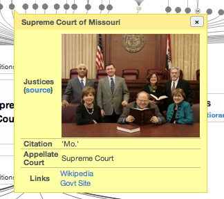

Some are more formal than others.
There is a lot of information to convey here. And I haven't even included the lower state courts yet (which, as noted by Eric Branson in the comments below, are the courts that most people will interact with). And there just didn't seem to be room for showing labels for all of the district or appellate state courts without throwing even more visual noise into the mix - although I think that I need to address this somehow. Avoiding visual noise is also why I don't have arrow heads/marks on the curves (although I must admit that dealing with and controlling the size of markers in svg is a pain).
It's debatable whether I should have tried to include the court seals as tiny thumbnails. But it gave me a chance to learn about the the mac sips command to resize the images, combined with image2css to create css classes to display them so as to avoid excessive image downloads from the server.
While the visualization is not currently responsive to dynamic changes in window size, it should adjust appropriately to a variety of different of screen sizes, as long as the height is at least 600px or so. Please let me know of any strangeness you might see.
While I plan on continuing to update/edit the various popups as I can find more information or need to correct things, my ultimate goal involves using a visualization like this to "watch" a year's worth of decisions play themselves out through the court system. Compiling the information needed for this is harder than one might think, because the citation/reporting system is not particularly conducive to pulling data in this way. As far as I can tell, there is no universal "id" of a case that is easy to reliably scrape out of decisions - some degree of hand editing/curating seems to be necessary. However, maybe this will not be as big a task as it might seem at the moment - at least for a qualitative experiment.
Any errors and/or omissions in this (beta!) visualization are mine. But I want to acknowledge the assistance from Mike Lissner and Brian Carver at the Free Law Project in answering my stream of newbie questions regarding the judicial system.


No comments:
Post a Comment